AcadeME placement platform redesign
Three Audiences. One Platform. One Redesign.
AcadeME is a placement platform with an unusually complex challenge: it needs to work perfectly for three completely different user groups - universities, students and graduates, and employers searching for academic talent. I led the full UX redesign of the platform, with the goal of turning a cluttered, outdated system into something each of those audiences would actually want to use.
A Platform That Was Getting in Its Own Way
The existing interface had potential - but it was buried under layers of design decisions that had accumulated over time without a coherent system. The problems were clear:
For a platform where students are making career decisions and employers are investing in hiring, that kind of friction has real consequences.
AcadeME old design - desktop and mobile
AcadeME old design - additional screens
Understanding the Market Before Touching the Design
I started with competitor research - signing up for similar platforms in Israel and internationally, examining their workflows, and mapping what was working and what wasn't. This gave me a clear picture of where AcadeME could differentiate itself.
I then led brainstorming sessions with AcadeME's CEO, drawing on his firsthand knowledge of both registered students and employers. Together we decided what to keep, what to cut, and how to dramatically reduce the system's visual and cognitive load.
Competitor platforms research
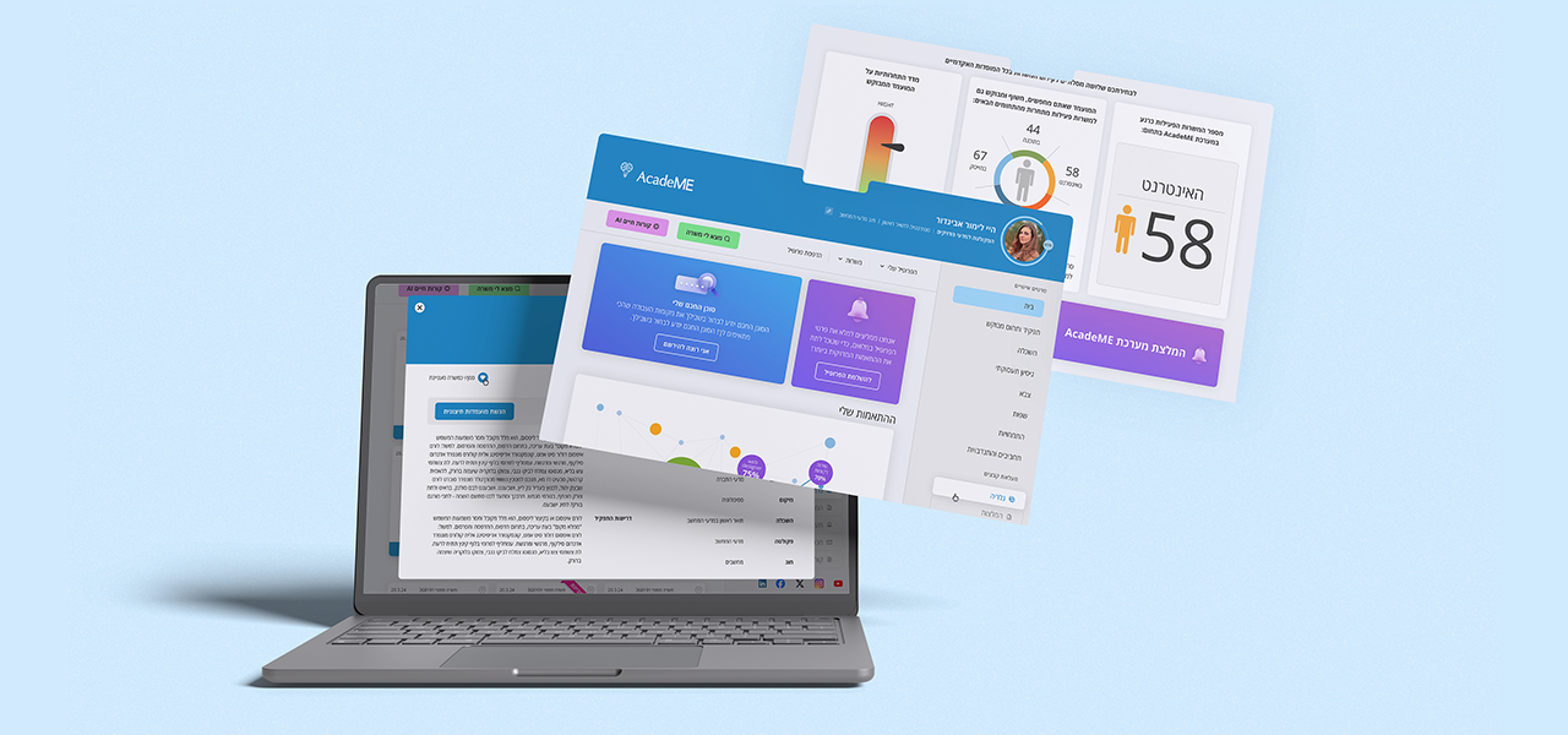
From Patchwork to Product
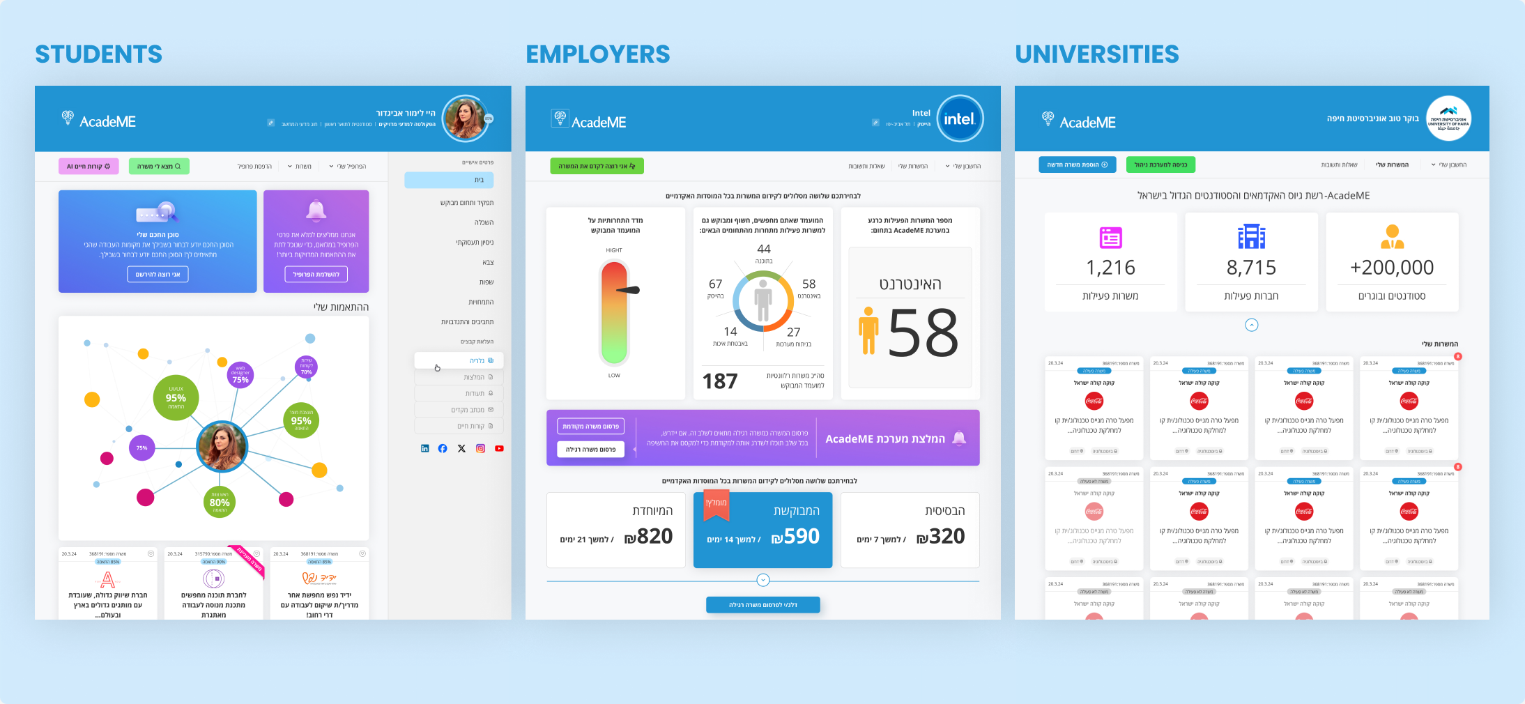
The redesign introduced new features tailored to each audience:
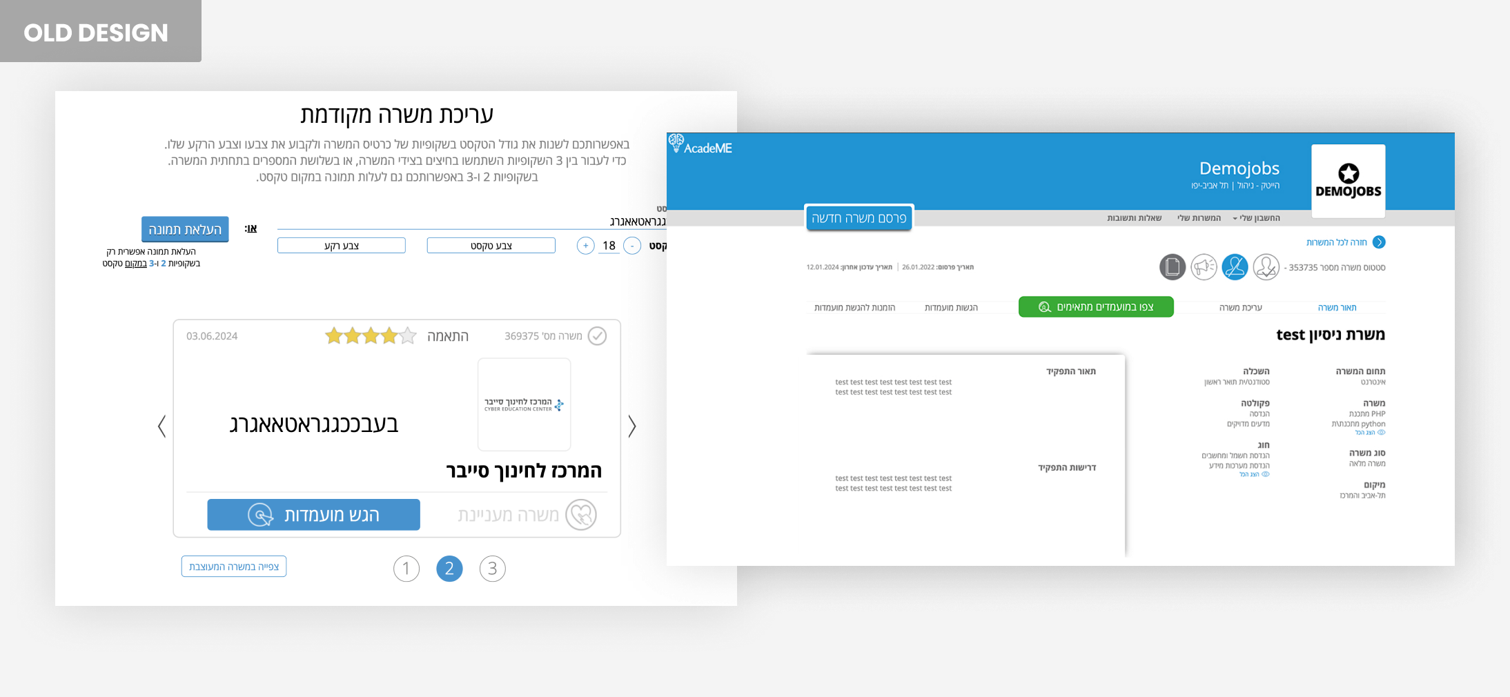
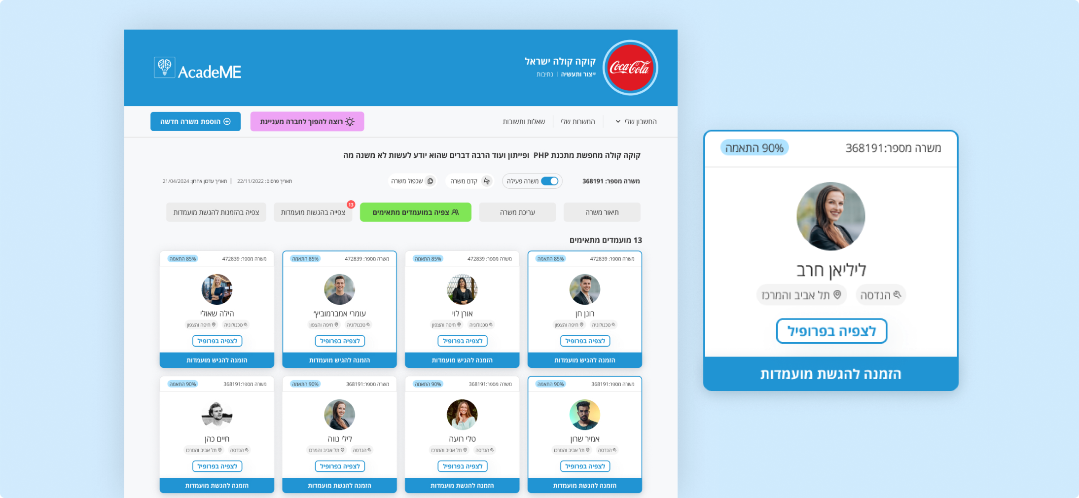
Cards that actually communicate
The old job cards were visually dense and hard to scan. The new cards are clean and focused - showing the match percentage prominently, a clear company logo, job title, location, and a single clear CTA. The ribbon adds a layer of personalization without adding noise.
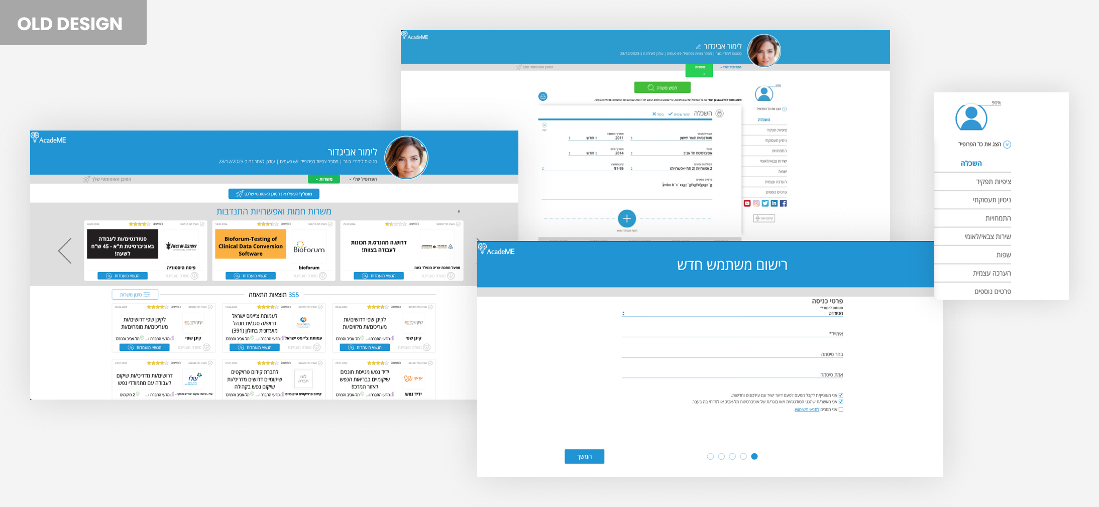
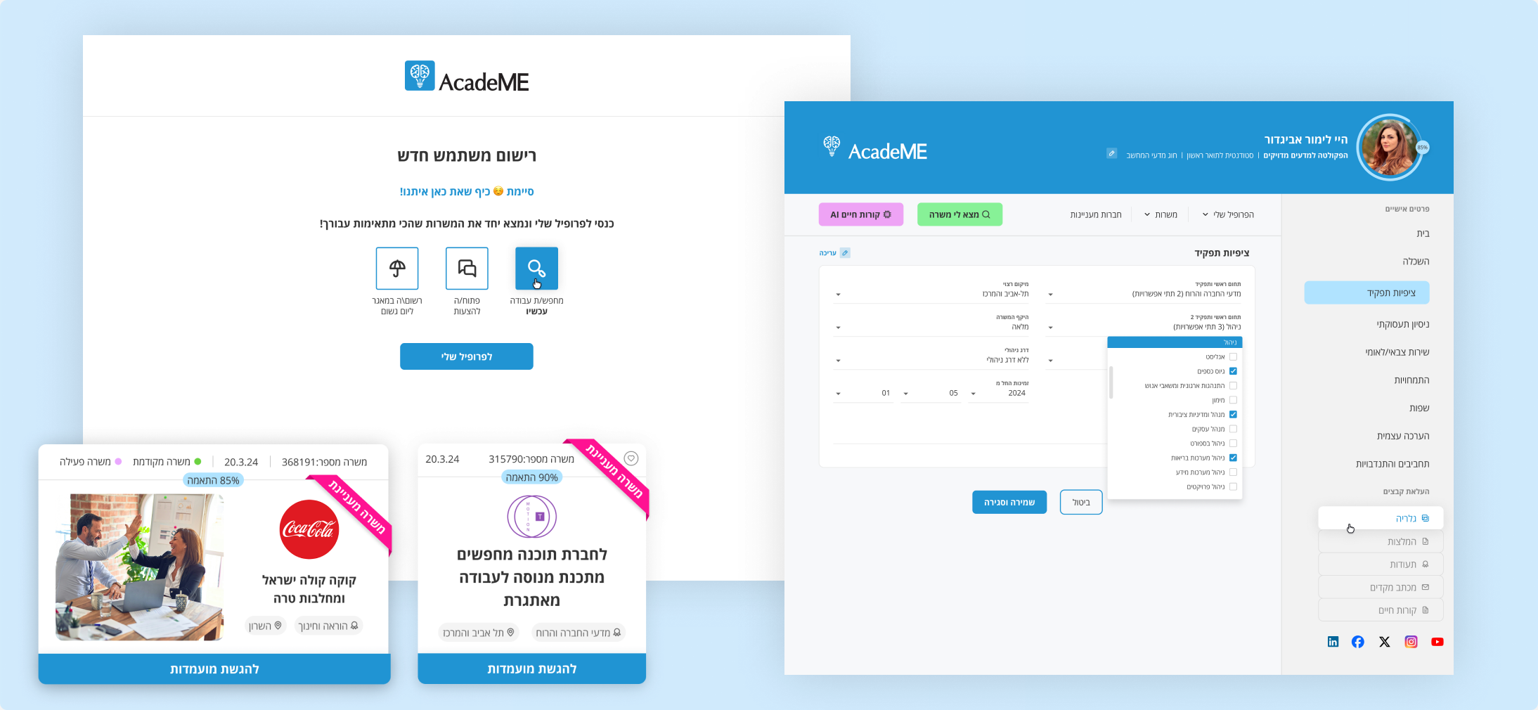
A registration flow that welcomes users
The old registration was a wall of fields. The new flow breaks the process into clear, numbered steps with a progress indicator at the bottom - so users always know where they are and how close they are to finishing. The final screen celebrates completion with a warm, friendly message and clear next steps. First impressions matter - especially when you're asking someone to invest time in building a profile.
Profiles that are easy to build and easy to read
The student profile was redesigned with a clean sidebar navigation, clear section hierarchy, and an edit mode that's intuitive and uncluttered. The profile completion percentage gives users a clear goal to work toward.
AcadeME new design - registration, profile and cards
A homepage that shows value immediately
The student homepage now leads with an animated match percentage display and surfaces the most relevant job listings right away - organized by relevance, not just recency. The employer dashboard opens with key platform stats (1,216 active jobs, 8,715 active companies, 200,000+ students and graduates) - giving immediate context and confidence in the platform's scale.
Company profiles that employers actually want to fill in
A dedicated company profile page lets employers present their brand properly - with cover images, social links, employee testimonials, videos, job listings, and a map. It's designed to attract talent, not just list vacancies.
Consistency as a feature
Across every screen - student, employer, and university - a unified design language was applied: consistent typography, color usage, icon style, spacing, and interaction patterns. What used to feel like a patchwork now feels like a product.
AcadeME new design - students, employers and universities
AcadeME new design - employer screens
The Goal Behind Every Decision
Turn AcadeME into the platform of choice for students, employers, and universities alike - not by adding more, but by making everything that's already there work better. Efficient, engaging, and built to stand out in a competitive market.