MedHub-AI uses deep learning video analysis to give physicians real-time diagnostic insights, but its interface was getting in the way. I led a full UX redesign to turn a complex, outdated system into something cardiologists could actually rely on: intuitive, accessible, and built around the way they work.
MedHub-AI was already deployed in two hospitals in Israel and around ten in Japan-which meant real users, real workflows, and real pain points to learn from.
The operations manager maintained direct contact with the Japanese team, gathering ongoing feedback from the field. In parallel, I made several visits to the Israeli hospitals, observing the system in action during live procedures and speaking directly with the technicians, physicians, and clinical staff who used it every day.
With everything we learned, I sat down with the CEO, COO, operations manager, and clinical engineers to redesign the system from the ground up. Every decision was grounded in what we heard, saw, and understood from the people in the room.
All of this happened under a tight deadline-the goal was to be ready for a major medical conference in Japan, just a few months away.
(Spoiler: it went well.)
The new system was met with enthusiasm and long lines of medical professionals eager to try it, and immediate requests from hospitals in Japan for real-world implementation.
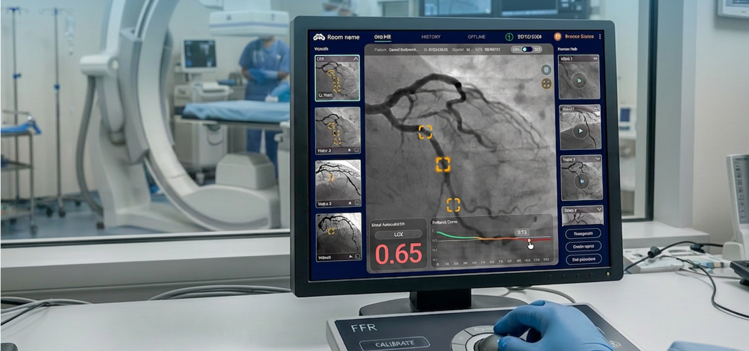
When a patient is on the table, there is no room for friction.
The redesign of MedHub-AI wasn't about aesthetics, it was about giving cardiologists and technicians the fastest, clearest path to a decision.
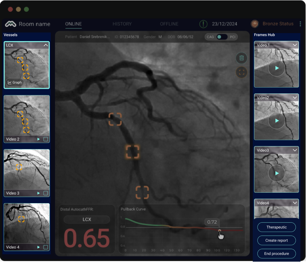

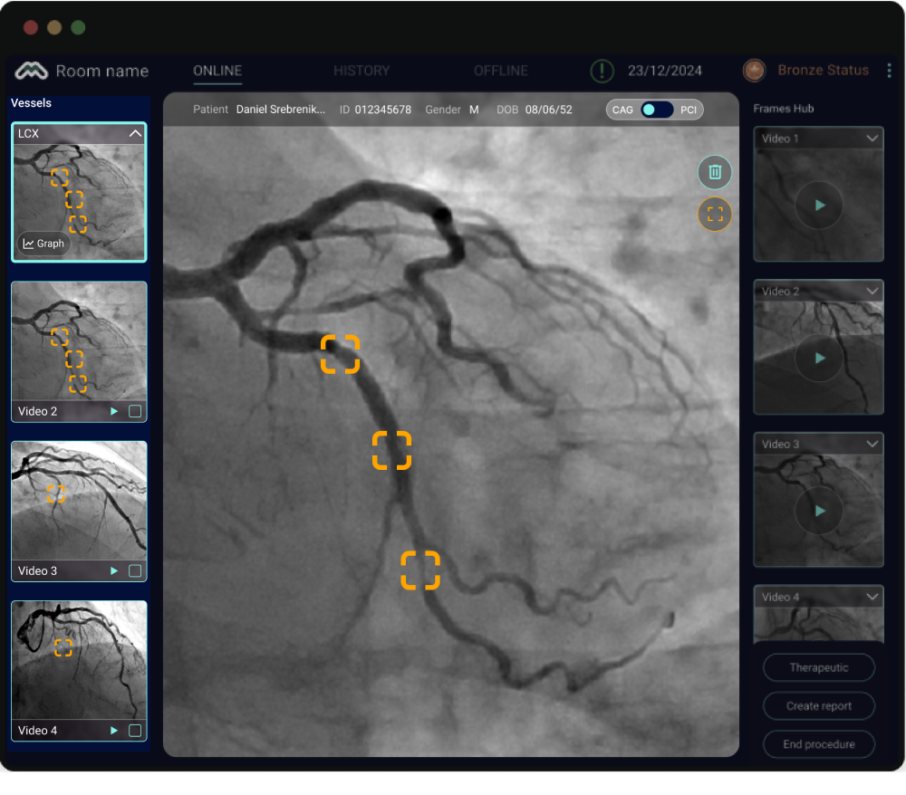
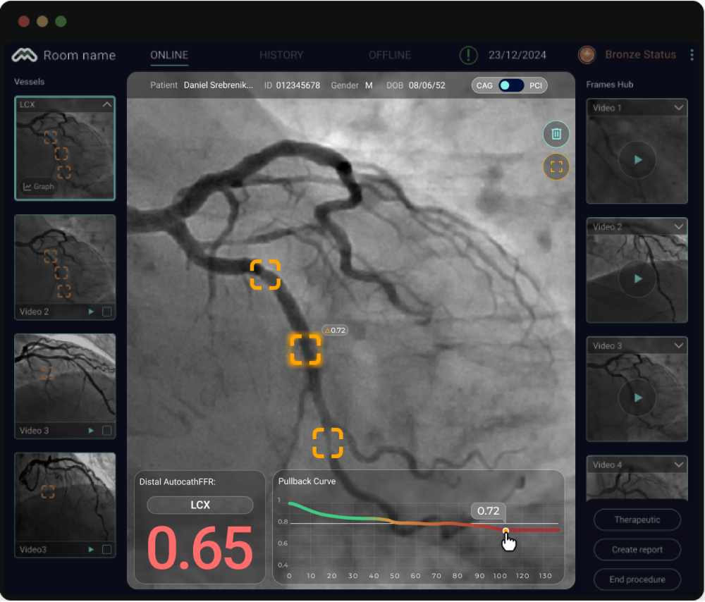
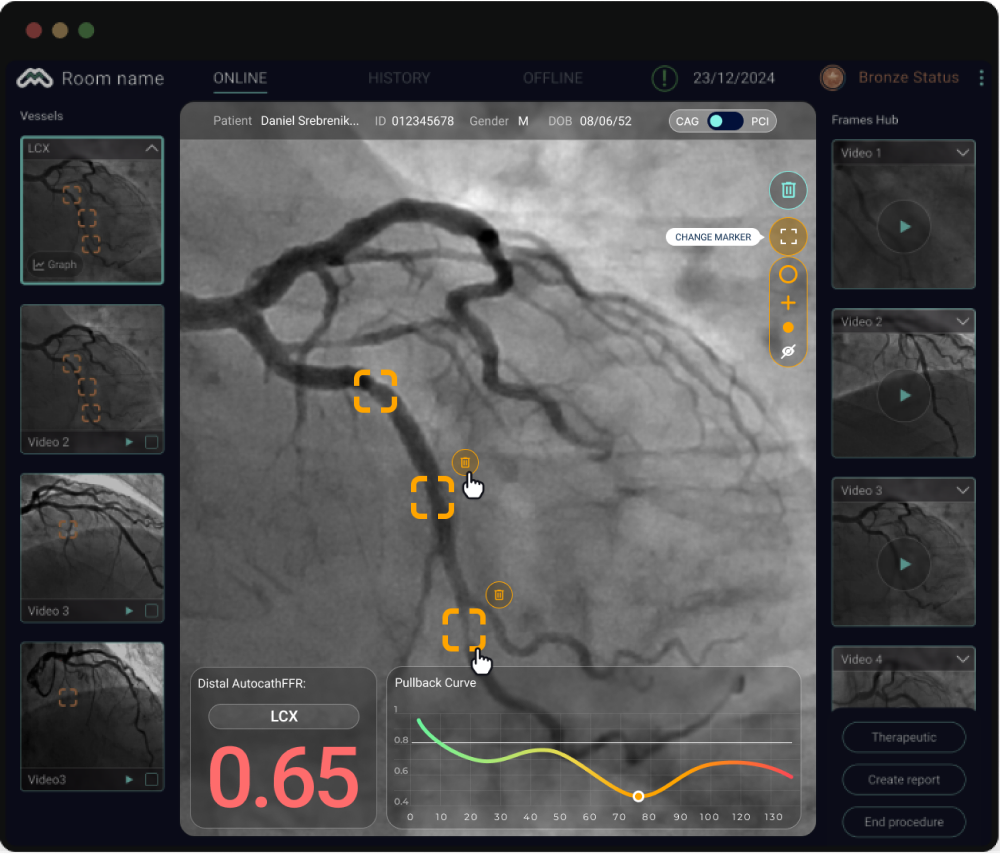
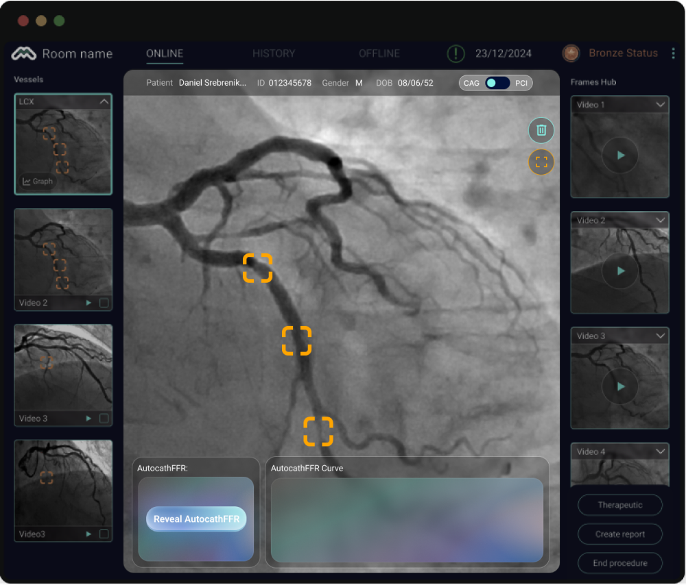
A cardiologist can now walk into a procedure, see every stenosis, interact with the data, and make a treatment decision, all within the same screen, in under a minute. Because the best medical interface is one the physician never has to think about.
Every decision in this redesign came down to one question: does this help the cardiologist focus on the patient - or does it get in the way?
The conference was a turning point, and so was what followed. MedHub-AI received approval from the Japanese Ministry of Health, meaning the Japanese healthcare system now pays per use of the platform. That changed everything about how we thought about the product experience.
We solved the monetization challenge on two levels.
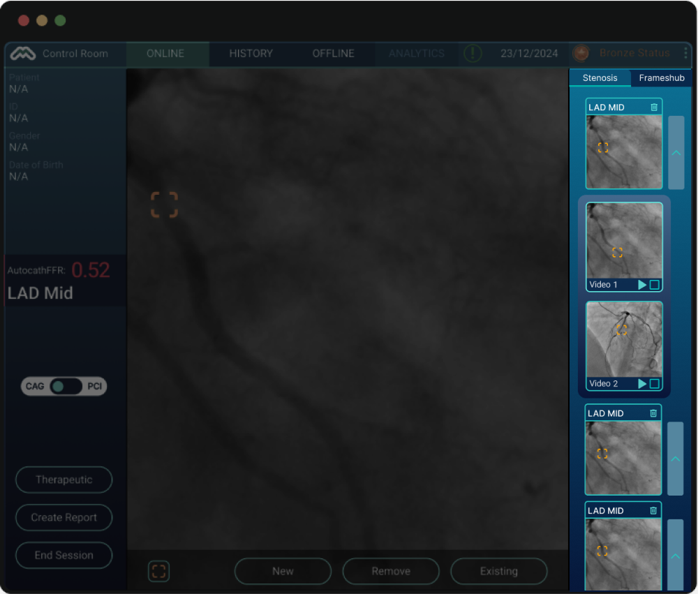
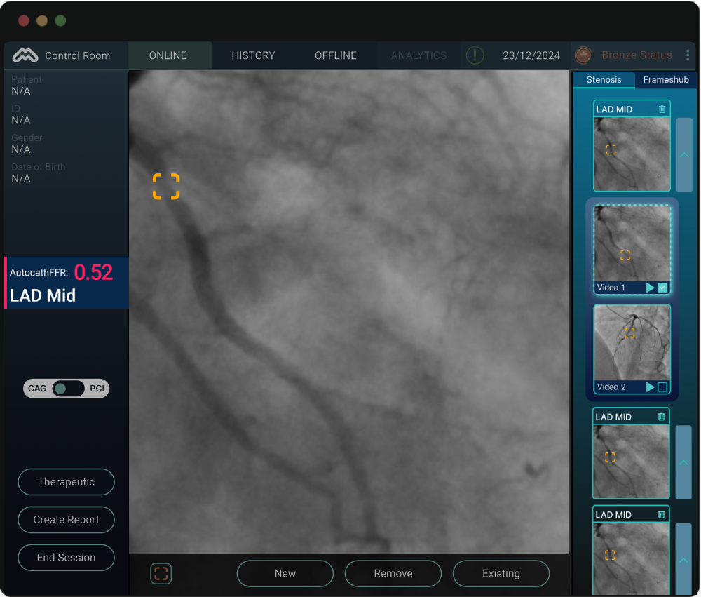
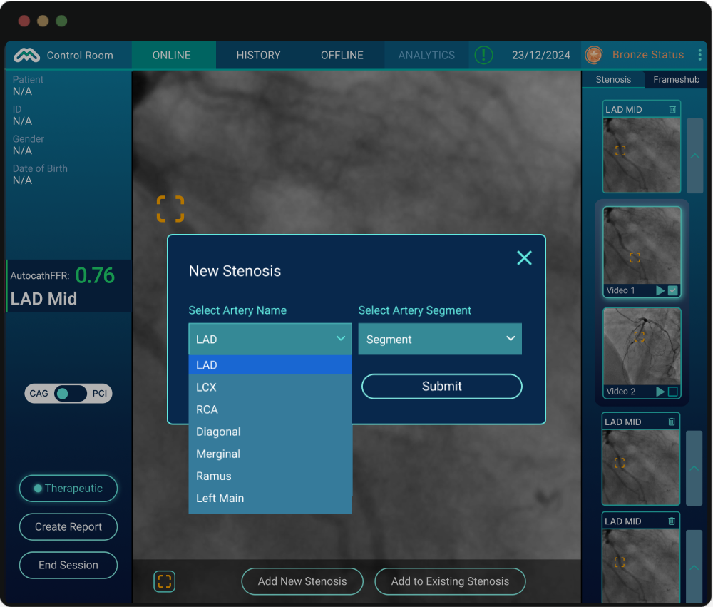
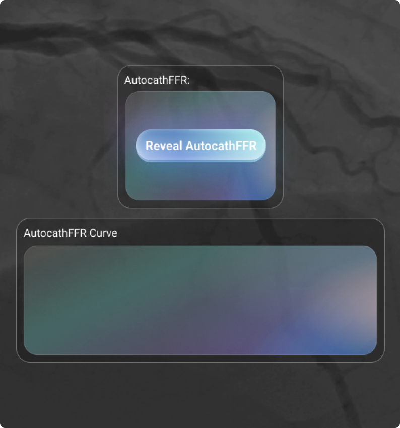
The first was functional. The system remains free to use-but the Pullback Curve graph and AutocathFFR results are hidden by default. A single tap on the "Reveal AutocathFFR" button unlocks the full diagnostic output and enables the physician to generate a structured report. Simple, unobtrusive, and directly tied to the billing moment.
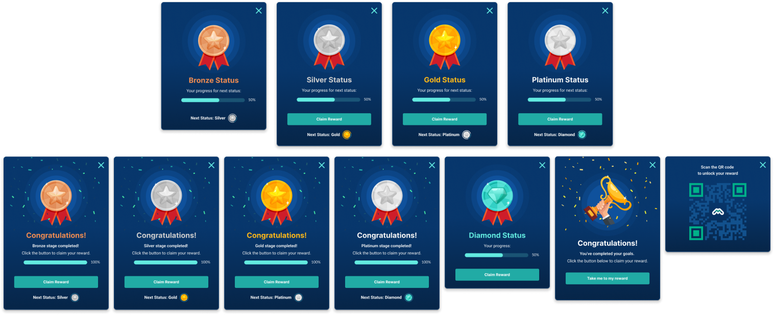
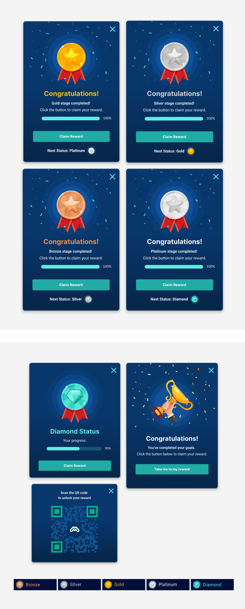
The second was cultural. Japan is a unique market, and even in a serious medical context, we made a deliberate choice to bring in an element of lightness. We introduced a gamification layer: the more a physician uses the system, the higher they climb through a tiered status system-from Bronze all the way to Platinum. Each milestone is celebrated with a QR code popup leading to a reward, designed in a distinctly Japanese aesthetic, complete with a confetti animation to mark the occasion. Progress is always visible in the top navigation bar, giving users a quiet but constant sense of advancement.


My father was a heart patient. He underwent catheterizations and two cardiac surgeries. This project was never just a brief - it was personal. And that made every design decision feel like it mattered.

