OurCrowd homepage redesign
Users Were Landing. Nobody Was Staying.
The OurCrowd homepage wasn't doing its job. Users were arriving-and leaving without signing up. When we looked closely at the page, it wasn't hard to see why:
For a platform managing serious investment capital, that's a trust problem. And a trust problem is a conversion problem.
Old OurCrowd design
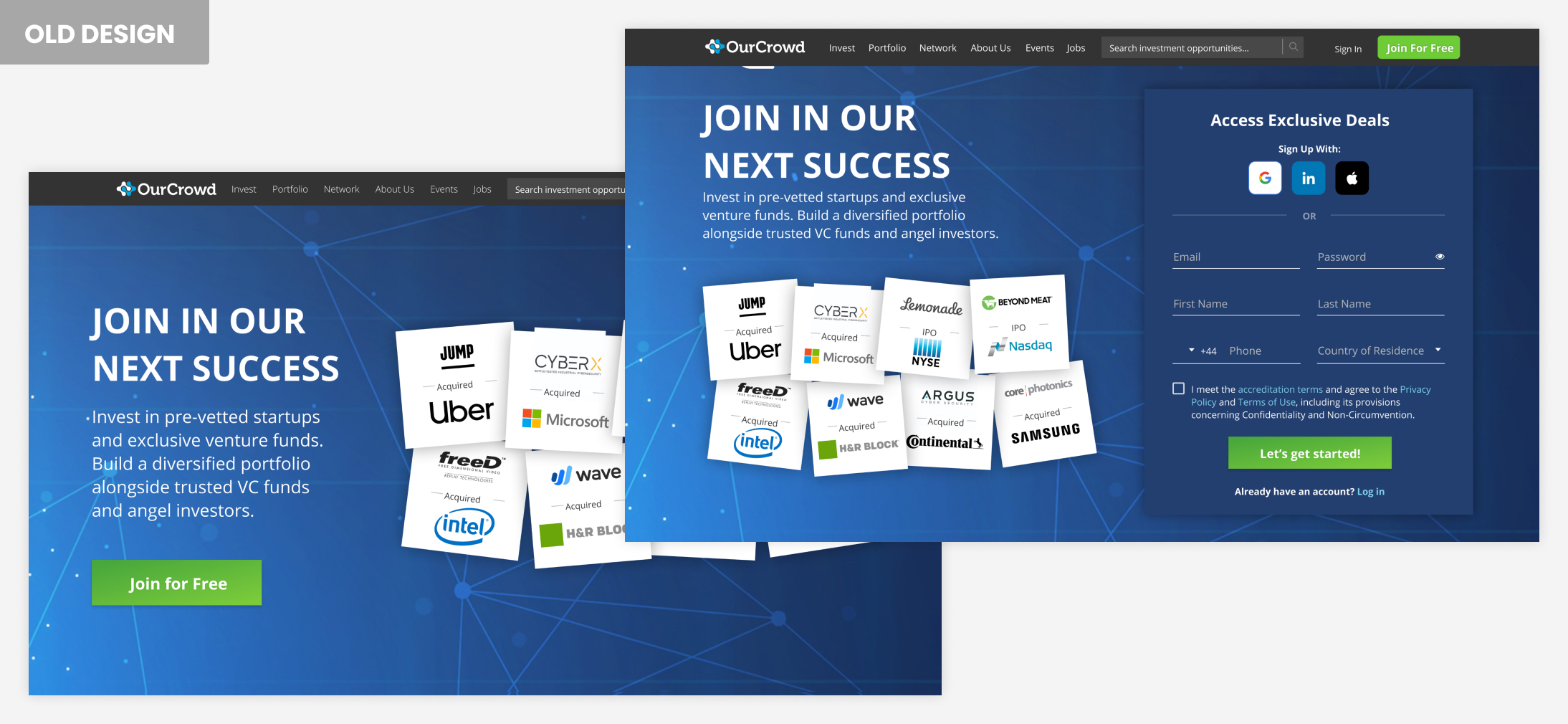
What the Competition Was Getting Right
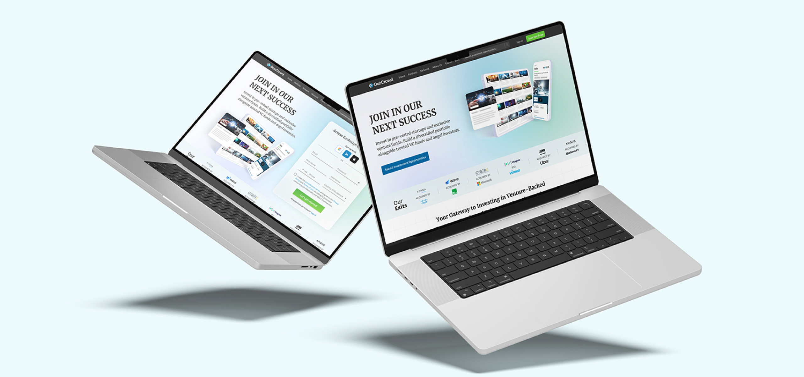
Working closely with the Top Funnel Product Manager, I started with a thorough analysis of the existing site - mapping what was working, what wasn't, and where users were losing interest.
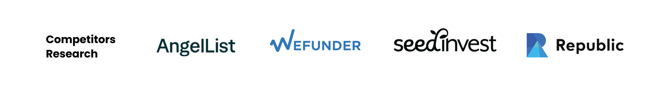
I then ran a competitive review of leading investment platforms, looking for design patterns that communicated trust, authority, and clarity. That research shaped every decision that followed.
Competitor platforms: AngelList, Wefunder, SeedInvest, Republic
Making OurCrowd Look Like What It Actually Is
The redesign was built around one goal: make OurCrowd feel as credible and modern as it actually is.
The platform was finally showing what it had always been: a world-class investment destination.
The homepage success set off a ripple effect - leading to a full redesign of the entire website.
New OurCrowd design across desktop, tablet and mobile