OurCrowd sidebar redesign
A Menu That Was Working Against Its Users
The original sidebar had a fundamental problem: everything looked the same. A flat, unsorted list of items with no hierarchy, no grouping, and no visual logic, just one long scroll of options that gave users no sense of where they were or where they should go next.
The issues were hard to ignore:
For a platform where investors are making significant financial decisions, that kind of friction isn't just annoying. It erodes trust.
When Adding More Features Makes Everything Worse
The sidebar wasn't just a visual problem - it was a usability problem. As the platform grew and more features were added, the list kept getting longer and harder to navigate. It became clear that a structural solution was needed, not just a visual refresh.
Old OurCrowd sidebar - annotated issues
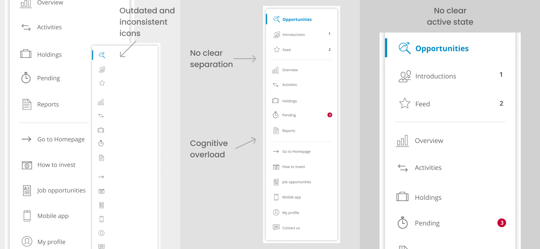
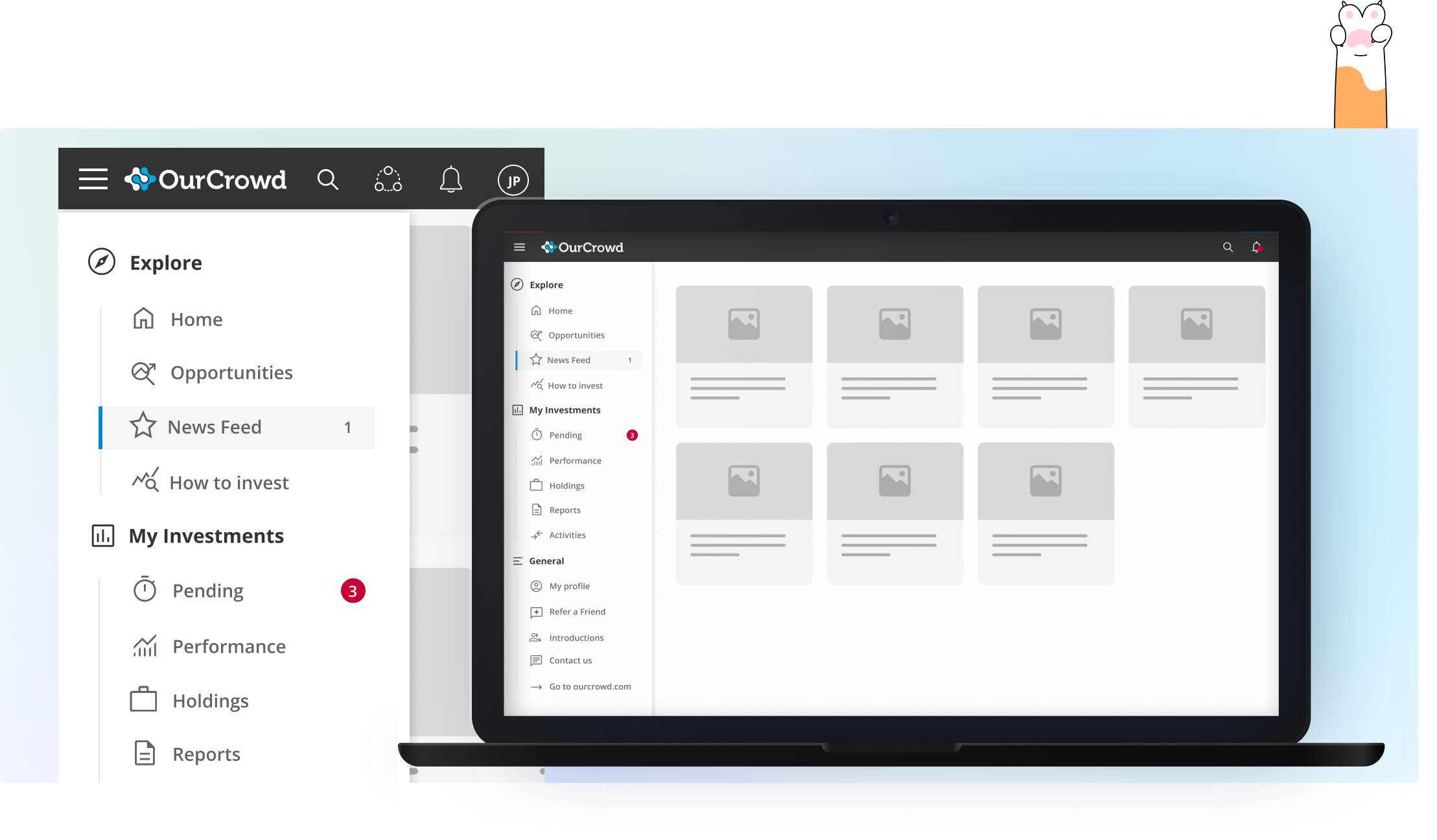
Why Three Groups? (and Not Four, or Two)
The grouping wasn't arbitrary. It was based on the mental model of OurCrowd's users, the way they actually think about the platform and what they come to do on it.
Investors naturally move between three modes: discovering what's available, managing what they already own, and handling account-level tasks. Explore, My Investments, and General map directly onto those three modes, which means users don't need to learn a new system. They already understand it intuitively before they've even clicked anything.
Built to Be Accessible
The original icons were decorative at best and confusing at worst - inconsistent in style, small in size, and low in contrast. The redesigned icon set was chosen for clarity and consistency: each icon actually reflects the content it represents, the sizing is comfortable across screen sizes, and the contrast ratios meet accessibility standards. Navigation shouldn't require effort - and it especially shouldn't exclude anyone.
A Structure That Can Grow
One of the less visible but equally important decisions was designing for scale. The three-group structure isn't just cleaner, it's built to absorb future features without breaking. New items can be added to the right group without disrupting the hierarchy or forcing another redesign. That kind of structural thinking is what separates a quick fix from a long-term solution.
New OurCrowd sidebar - three-group navigation